Featured Websites | CUTTING-EDGE WEB DESIGN & DEVELOPMENT
At Mermaid, Inc., we craft award-winning, custom-designed websites with meticulous attention to detail, perfectly aligning with each client's unique brand and vision. Our commitment to SEO-friendly and innovative design is unmatched. We excel in creating bespoke SquareSpace websites, blending stunning aesthetics with robust functionality. Dedicated to responsive and mobile-friendly design, we guarantee an outstanding user experience across all devices. Partner with us and watch your digital presence leave a lasting mark in the ever-evolving online landscape.
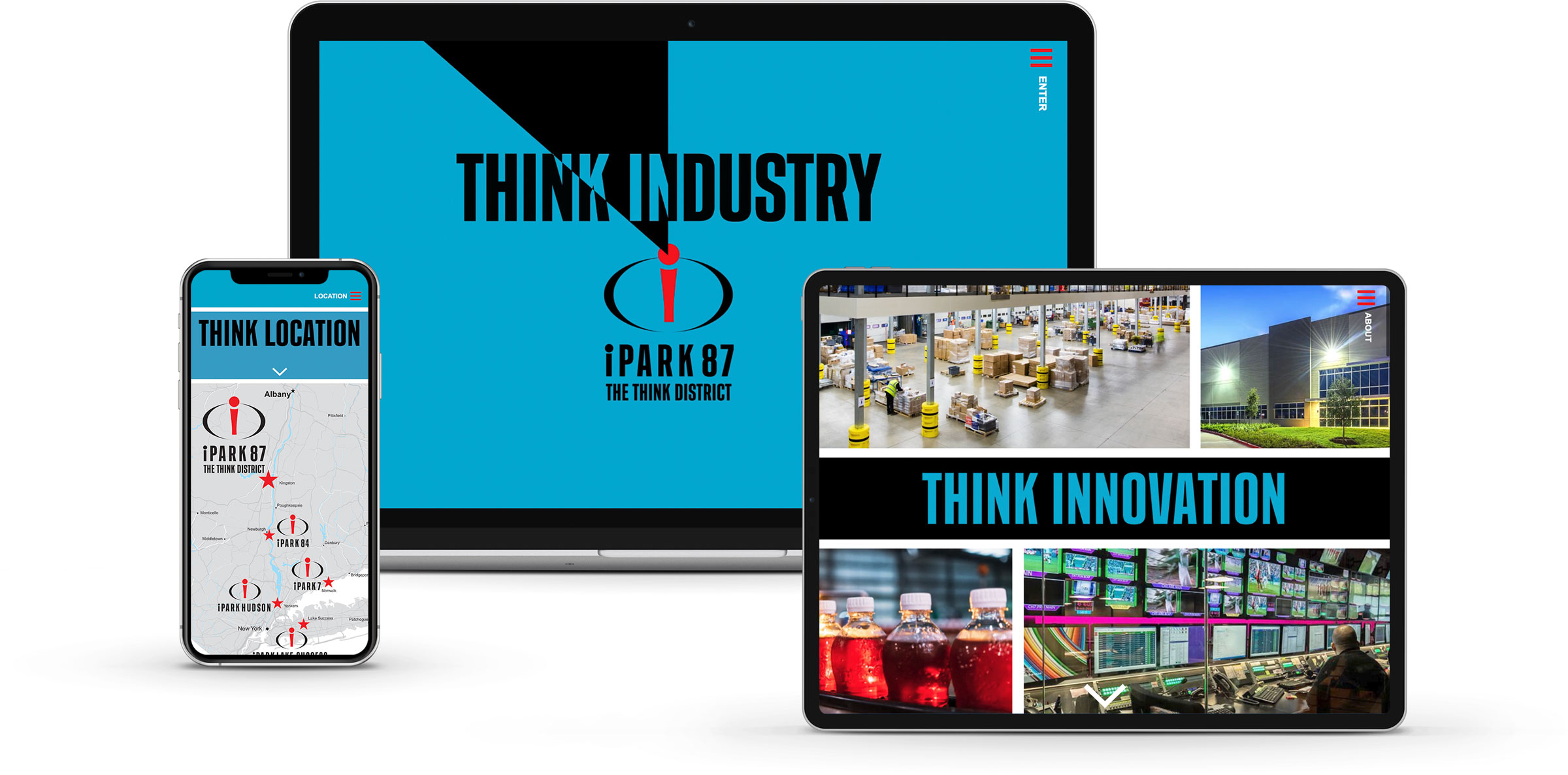
Set on the grounds of the former IBM Kingston facility, iPark 87 unites cutting-edge office environments with a legacy of technological advancement. Tasked by National Resources, our mission was to forge a distinct brand and online presence that mirrors the cutting-edge spirit of sectors like technology, media, and content creation.
APPROACH
Our creative direction was heavily influenced by the iconic 'Think' motto associated with IBM, weaving this philosophy throughout the website's design to encourage innovative and forward-looking thought.
Our strategy for iPark 87 was driven by a deep respect for its historical significance in technological innovation. We aimed to craft an identity and digital experience that would appeal to the current generation of innovators and thinkers, telling a story that connects the site's pioneering role in technology, media, and content with today's digital landscape.
Leveraging the renowned 'Think' motif, we introduced expressions such as 'iPark 87, The Think District,' 'I think, therefore iPark 87,' 'Think Future Forward,' and 'Rooted in a Culture of Think.' These phrases serve not merely as engaging copy but as a link between the site's storied history and its potential for future breakthroughs.
RESULTS:
The site now stands as a testament to creative thinking and innovation, attracting a wide array of tech companies and startups looking for an inspiring workspace. This project has been lauded for its inventive use of IBM's storied 'Think' legacy, effectively turning iPark 87 into a hub where the past and future of tech converge, fostering a vibrant community of forward-thinkers.
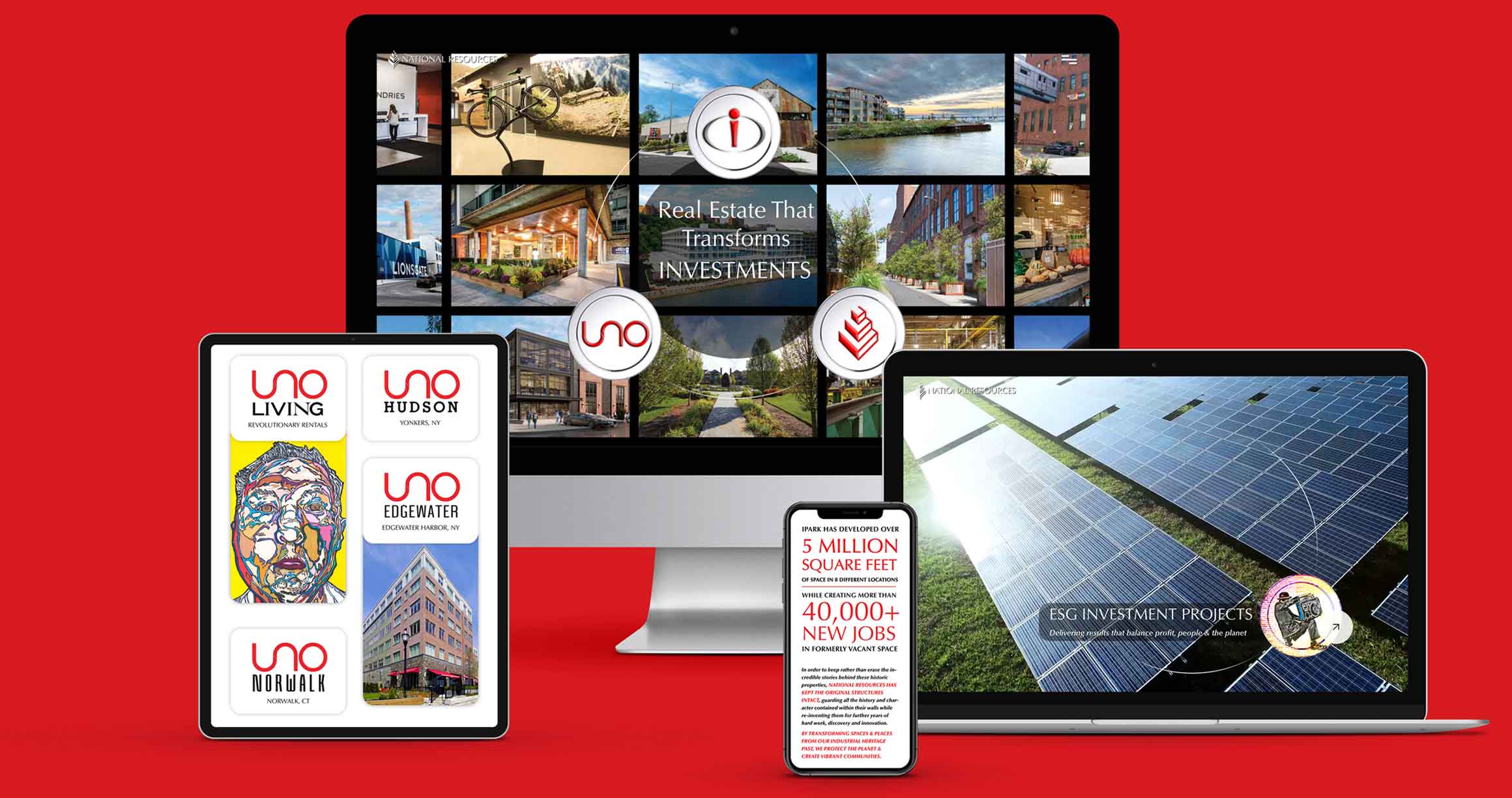
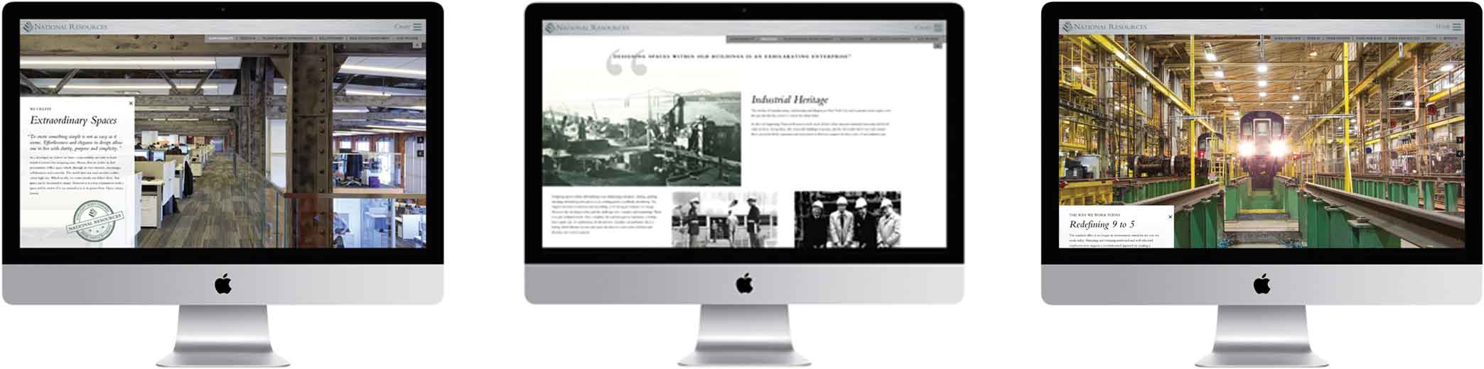
National Resources | REBRANDED REAL ESTATE DEVELOPER WEBSITE
National Resources, a dynamic real estate development and investment firm, specializes in revitalizing corporate and industrial sites. They engaged us to create a rebranded website that not only showcased their three main areas of investment but also distinctly set them apart from a typical real estate developer's website.
APPROACH
We responded by deploying engaging web design elements that highlight National Resources' investment areas with clarity and impact. Interactive property cards offer a deep dive into each project, enriched with animations, photos, texts, and videos. The website's bold red accents and dynamic visuals not only draw attention but also communicate the company's achievements and mission, setting a new benchmark for online real estate development presence.
RESULTS
The branding and website created for National Resources have significantly distinguished them in the real estate sector. Their unique approach to sustainability, reflected through the visually striking tokens and graffiti-style art, has resonated with their audience, showcasing their commitment to revitalizing spaces with respect for history and the environment. This fresh, innovative brand identity has not only elevated National Resources' market presence but has also attracted a new wave of interest from investors and partners who align with their vision for sustainable development.
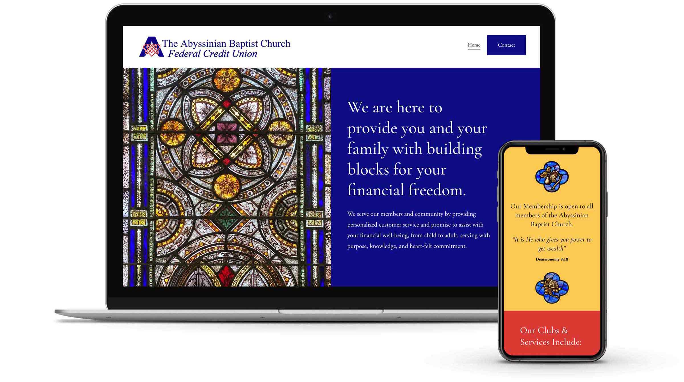
Abyssinian Baptist Church FCU | FAITH-BASED CREDIT UNION WEBSITE
Tasked by Abyssinian Baptist Church Federal Credit Union, we embarked on creating a logo and website that resonate with the values of this prominent Black federal credit union connected to Harlem's esteemed Abyssinian Baptist Church.
APPROACH
Our design philosophy embraced the union's ethos of compassion and member-focused service. Drawing creative cues from the breathtaking stained glass artistry of the church, we shaped the website's color scheme to mirror these hues, thus weaving a tapestry of warmth and welcome throughout the digital space. The integration of these stained glass motifs throughout the website offers visitors an immersive experience that reflects the church's spiritual ambiance and the credit union's commitment to its community.
RESULTS
The website with our logo design and stained glass-inspired palette, has been a resounding success. This project has elevated Abyssinian FCU's online presence, offering a digital space that warmly welcomes members with a blend of tradition and modern accessibility.
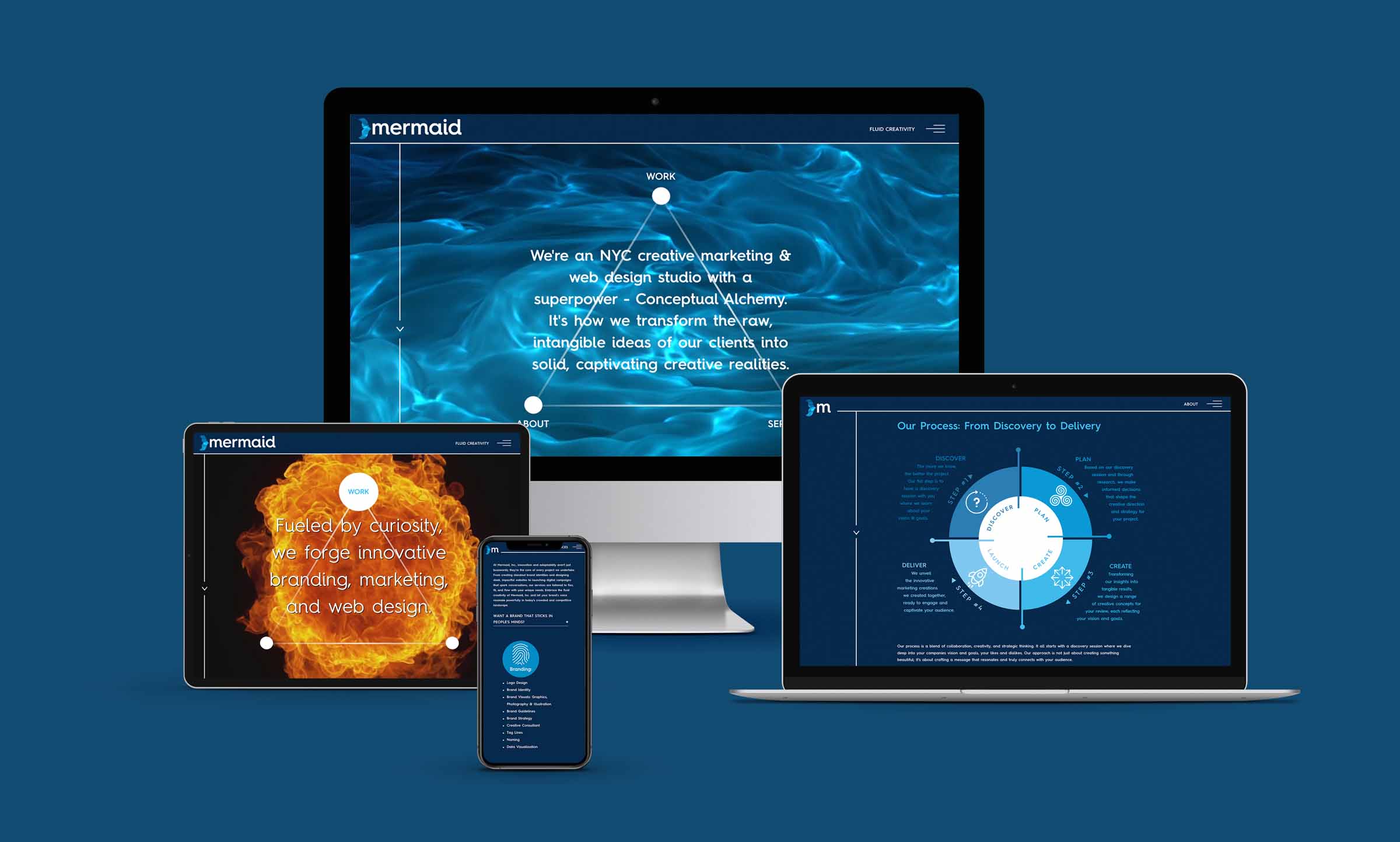
We're an award-winning creative marketing and branding studio based in NYC, blending boutique attentiveness with big agency expertise. Recently, we took on the exciting challenge of creating a new website and branding. Our aim was to showcase our unique approach to branding, the same one we bring to our clients, in a way that truly reflects our vision and style.
APPROACH
Our approach was deeply influenced by our belief in creativity as a fluid, ever-evolving process. Drawing inspiration from the adaptability and transformative power of water, we embraced the fluid world of mermaids as a perfect metaphor for our philosophy.
We wanted to visually embody our philosophy right from the homepage. A captivating, fluid, water-esque video underlines our declaration of "Conceptual Alchemy" superpower, seamlessly integrating with the "Work", "Services", and "About" navigation buttons. Each button offers a unique, surprise reveal on hover: the "Work" button unveils a burning flame video, symbolizing our curiosity-driven innovation; the "Services" button shows a contracting-eye video, representing our keen, cutting-edge perspective; the "About" button displays a morphing ball of liquid, reflecting our adaptable and dynamic "Fluid Creativity".
This thematic water-esque video not only forms the backdrop for our mermaid icon but flows through the site, enhancing the text with animated motion to underscore our adaptable, fluid approach to creativity and design.
RESULTS
The end result is a website and brand identity that we're absolutely thrilled with. It encapsulates our commitment to innovative, boundary-pushing ideas, and our embrace of a philosophy that encourages both individuality and adaptability.
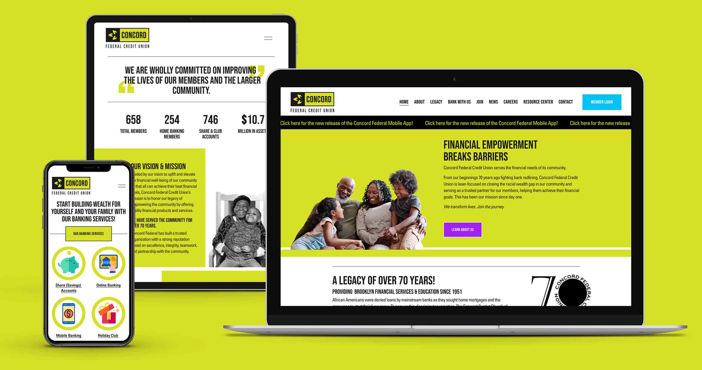
Concord FCU | BLACK-OWNED FEDERAL CREDIT UNION WEBSITE
Our mission was to encapsulate the essence of Concord Federal Credit Union through brand, logo, and website design. This Black-owned institution, located in the heart of New York's Bed-Stuy neighborhood, stands as a testament to economic resilience and empowerment.
APPROACH
Our creative journey began with crystallizing the credit union's essence into the powerful tagline “Financial Empowerment Breaks Barriers.” This statement became the cornerstone of our branding strategy, guiding the visual and narrative development of the project.
In designing the website, we sought to create a space that was both welcoming and informative. We achieved this by integrating contrasting imagery: historical black and white photographs of community members alongside vibrant, modern visuals of the credit union's services. This blend not only enriches the site's aesthetic but also reflects the credit union's commitment to bridging historical divides with present-day opportunities.
A standout feature of the website is a detailed timeline chronicling the Bed-Stuy community's history, highlighting the systemic challenges of redlining and showcasing the credit union's dedication to fostering economic justice. This interactive timeline serves not just as an educational resource but as a testament to the credit union's deep-rooted commitment to its community and to breaking down financial barriers.
RESULTS
The website stands as a testament to Concord Federal Credit Union’s values and has received positive feedback for its impactful design and user-friendly experience. The credit union and its members are thrilled with the results, finding the website to be an exceptional representation of their mission and commitment to financial empowerment.
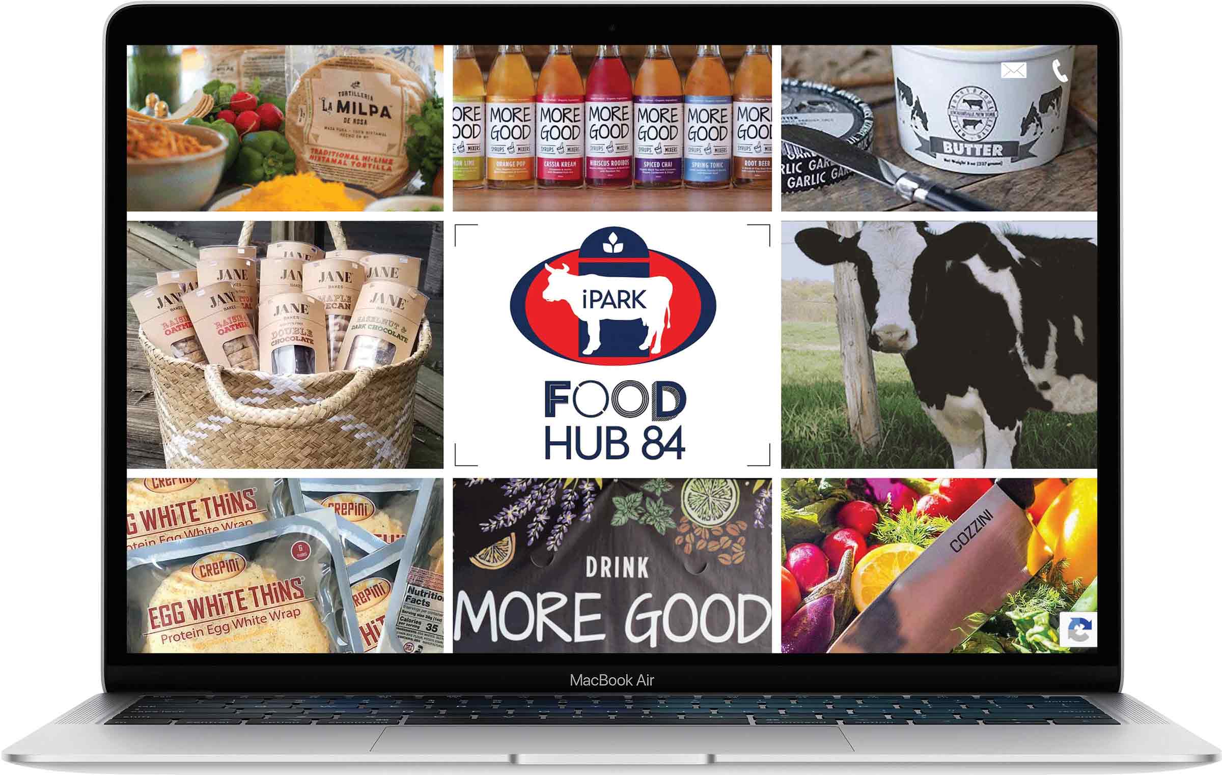
Tasked with crafting a comprehensive brand identity for FoodHub 84, we set out to design a logo, branding, marketing materials, and a website that encapsulates the essence of this innovative food and beverage production hub, aimed at connecting creators with both local markets and national retailers.
APPROACH
In a nod to FoodHub 84's commitment to supporting local craftsmanship while serving national needs, we devised a logo that marries traditional Americana with contemporary design elements. The logo brings together symbols of agrarian life—a cow, a plant, and a silo—set against a backdrop of modern Americana colors. This fusion not only highlights the venue's role in the food and beverage industry but also its emphasis on community and sustainability. To reflect the diversity of products crafted by its tenants, we employed a variety of font styles, lending a dynamic and eclectic feel to the brand's visual language.
RESULTS
The resulting brand identity for FoodHub 84 successfully embodies the venue's dual focus on local authenticity and broad market appeal. The playful yet grounded logo, along with the eclectic typography, has resonated with tenants and consumers alike, capturing the spirit of innovation and community that FoodHub 84 champions. This unique branding has positioned FoodHub 84 as a central figure in the modern culinary landscape, where tradition meets innovation.
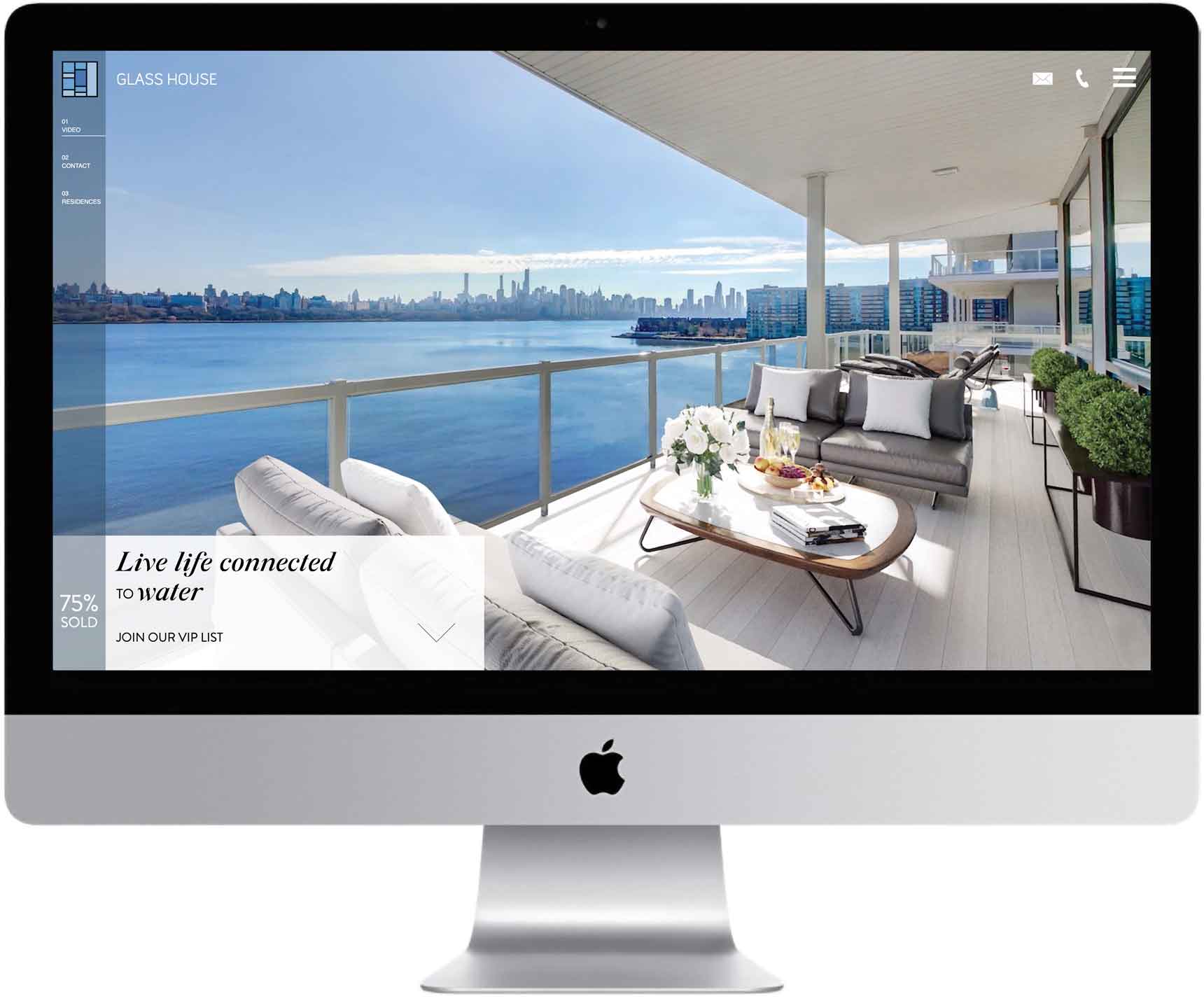
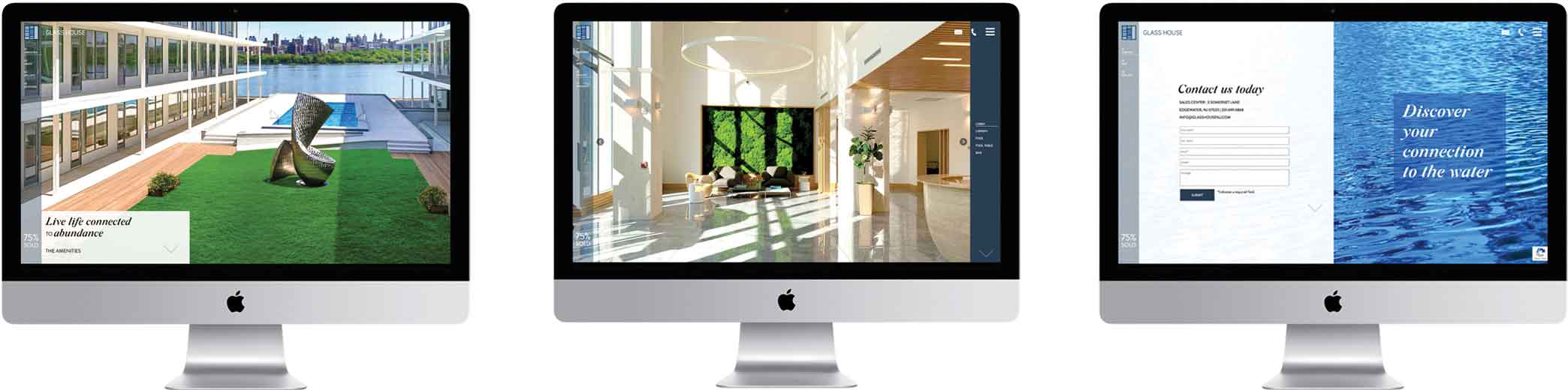
Glass House | ELEGANT WATERFRONT CONDOMINIUM WEBSITE
National Resources, a prominent real estate and investment firm, tasked us with rejuvenating the brand identity and updating the collateral for their Glass House Townhome Collection. This modern development, nestled directly along the Hudson River, combines townhomes and condominiums for a contemporary living experience.
APPROACH
In Phase III of our branding efforts, the development's enviable waterfront location inspired the theme "Live life connected to the water." We employed mesmerizing, full-screen imagery of the sweeping views and luxurious interiors to transport viewers right into the heart of waterfront living. This visual journey was designed to spark the imagination, allowing potential residents to envision a life seamlessly blended with the tranquility and beauty of the Hudson River.
RESULTS
Our refreshed branding strategy successfully heightened the allure of the Townhome Collection, reinforcing the Glass House's standing as a premier riverfront development. By skillfully highlighting the unique connection to the water, this campaign has further solidified the Glass House's appeal to those seeking a sophisticated, waterside lifestyle.
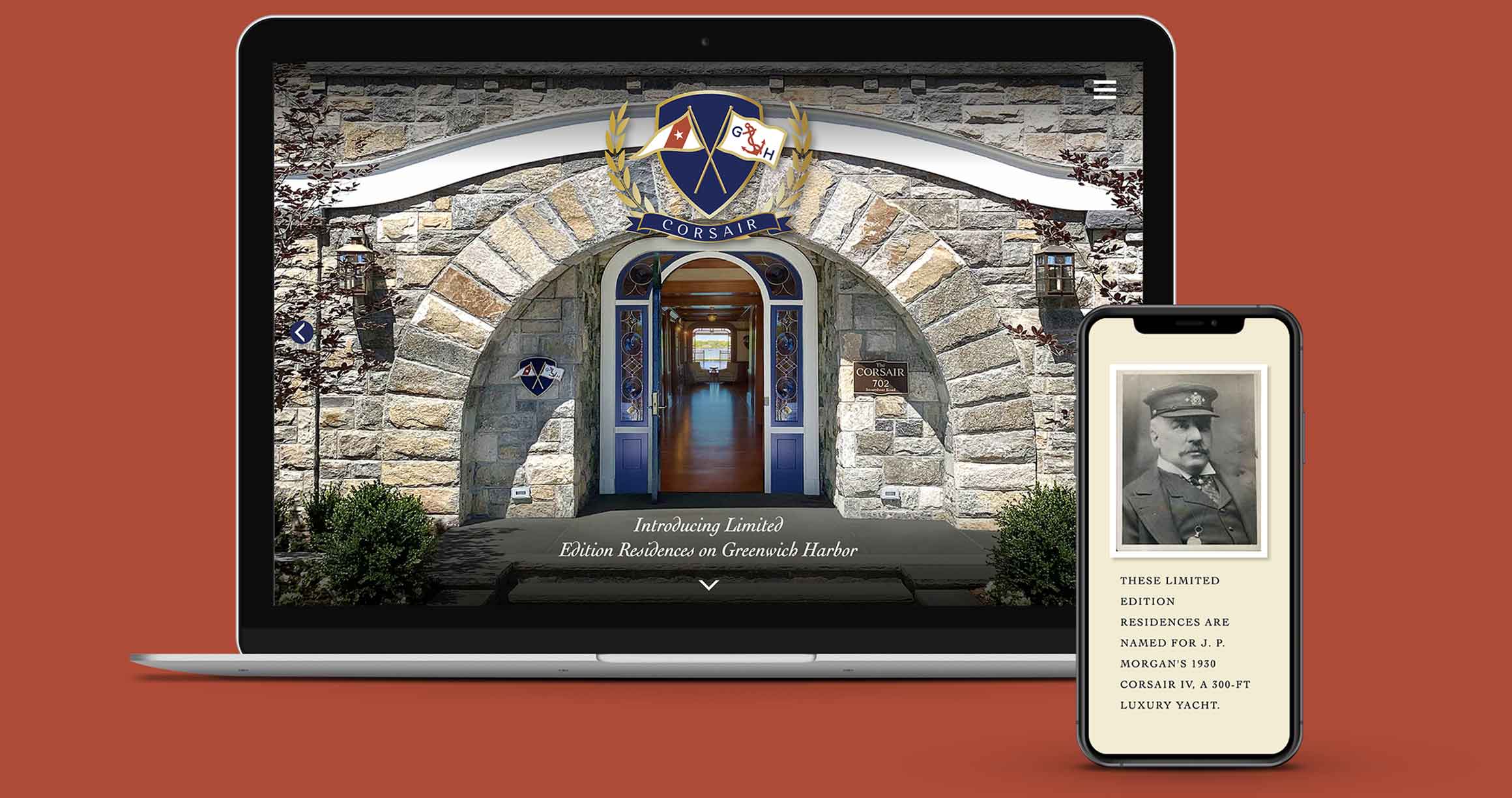
The Corsair | TIMELESS CONDOMINIUM RESIDENCES WEBSITE
Commissioned to forge a timeless brand for The Corsair, a boutique condominium on Greenwich Harbor, our mandate was to meld the ultra-luxury craftsmanship of J.P. Morgan's legendary yacht with contemporary comforts and design.
APPROACH
Acknowledging that these residences are designed to become heirlooms, we introduced the Corsair Crest, a symbol marrying modern nautical elegance with the storied legacy of its namesake. This initiative extended to curating a collection of artifacts and images linked to both the yacht and J.P. Morgan himself, thus intertwining historical grandeur with modern luxury. This narrative was carefully woven into every aspect of the brand, illustrating the exclusive waterfront lifestyle afforded to Corsair residents.
RESULTS
Our strategic branding and storytelling have positioned The Corsair as a beacon of timeless luxury in a market dense with high-end developments. The unique blend of history, craftsmanship, and modernity in the brand identity has distinguished The Corsair, captivating a discerning clientele aspiring to a luxurious waterfront existence.
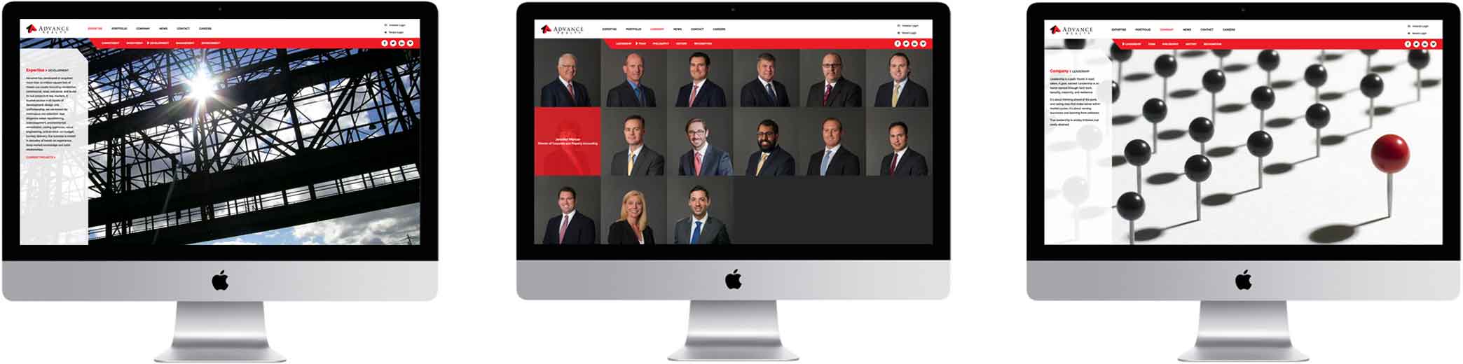
National Resources | DISTINCTIVE REAL ESTATE DEVELOPER WEBSITE
AWARDS > Graphis Design Silver | Creativity International | HOW International Design
ASSIGNMENT
National Resources tasked us with creating a comprehensive branding strategy, including a website overhaul, visual identity refresh, and investor materials. The goal was to highlight their niche in revitalizing historical buildings and transforming industrial sites into distinctive living and working environments.
APPROACH
In collaboration with National Resources, we distilled their essence into four pillars: Create, Live, Work, & Sustain. The website design orbits these themes, integrating sustainable and recycled materials' textures—stone, wood, and metal—into its navigation to echo the firm's commitment to eco-friendly development. A "mega" menu showcases their extensive portfolio of developments, allowing easy navigation and instant access to various site areas. This approach ensures users can explore the vast array of projects without feeling overwhelmed. Additionally, "Stats at a Glance" for each project provide quick insights into location, amenities, size, and more, catering specifically to investor interests.
RESULTS
This revamped digital presence successfully elevates National Resources' brand, articulating the breadth and quality of their projects. The website not only enhances their market position but also clearly sets them apart from competitors, offering a rich, user-friendly experience that aligns with their innovative approach to real estate development.
Trusted Advocate tasked us with developing a website and brand identity that addresses crucial concerns: ensuring lawyer credibility, fairness in fees, and adherence to agreements.
APPROACH
Introducing a groundbreaking platform for legal consultations, we crafted a logo that features dawn's rays encircling a commanding “T”, symbolizing new beginnings and innovative solutions. The website leverages a serene image of sunrise over sunflowers, embodying hope and fresh perspectives. By blending affirmations of Trusted Advocate’s values with tangible insights into their operations, we created a digital space that instills confidence and trust during stressful times. This strategic combination of symbolic imagery and clear, factual content articulates Trusted Advocate’s dedication to transparency and client empowerment.
RESULTS
The website and brand identity resonate deeply with the ethos Trusted Advocate aims to project, significantly enhancing client acquisition. Their innovative approach to legal services, visually and functionally represented through our designs, is setting a new standard in the legal field, fostering trust and optimism among those seeking legal counsel.
iPark 84 | UNCONVENTIONAL TECH-FOCUSED OFFICE PARK WEBSITE
Our task was to devise a compelling name and website for a newly envisioned tech-centric office park.
APPROACH
Introducing "iPark 84," we spotlighted its strategic position off Interstate 84, enhancing its appeal with a high-speed video montage on the website. This montage captures the essence of iPark 84, highlighting location convenience, cutting-edge office spaces, expansive warehouses, and vibrant local life. Set against a stylish, translucent black overlay, the video injects a modern vibe into the site. The website's modular design allows for the seamless introduction of new spaces, while its innovative scrolling mechanism offers an interactive user experience that mirrors the park's forward-thinking ethos.
RESULTS
This innovative approach has vividly brought to life the unique qualities of iPark 84, contributing to its swift lease-up. The name and website together underscore the office park's modernity and tech orientation, appealing directly to its target audience and setting it apart in the marketplace.
Fete Jardin | NYC FLORAL DESIGN eCOMMERCE WEBSITE
AWARDS > Creativity International
ASSIGNMENT
Our mission was to develop both a website and brand identity for Fete Jardin, an upscale, boutique floral design house located in the heart of New York City.
APPROACH
The website showcases a collection of high-end, fashion-forward typography and imagery, channeling an aspirational lifestyle marked by beauty and elegance. Pairing this sophisticated visual language with captivating photographs of Fete Jardin's exquisite floral arrangements, we crafted an online presence that transports visitors to the romantic era of La Belle Époque, filled with lush, enchanting beauty.
RESULTS
The launch of this elegant website and branding initiative has led to a surge in orders, successfully cementing Fete Jardin's status in the luxury floral market.
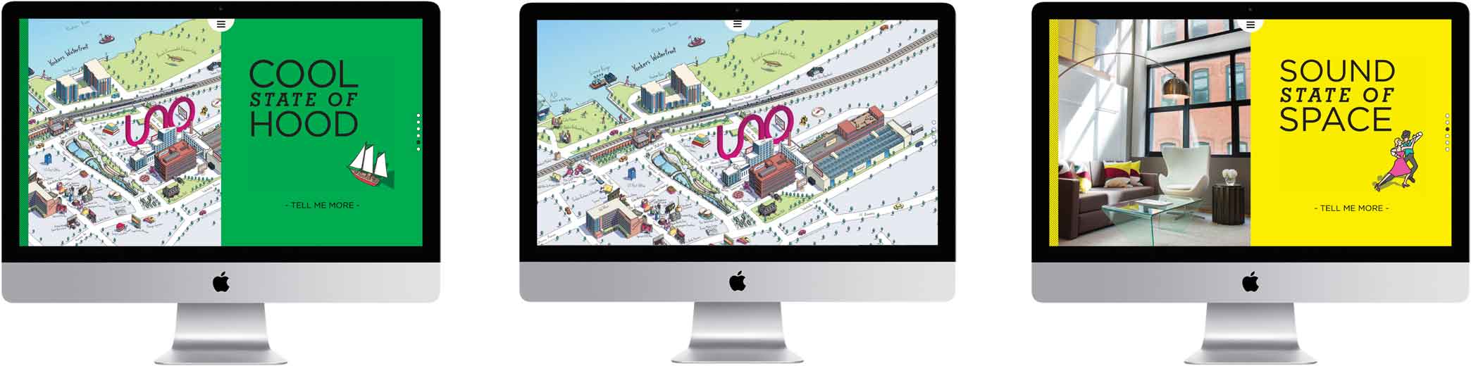
National Resources, a forward-thinking real estate and investment firm, sought the expertise of Mermaid, Inc. for creating the website, brand identity and marketing materials for a unique rental project. This project involved transforming the iconic Otis Elevator and Herald Statesman buildings into contemporary loft and micro-flat residences, specifically targeting the millennial demographic.
APPROACH
At the heart of this website is a novel screen animation technique: the left side ascends while the right descends, seamlessly unveiling the brand's core messages. The tagline, “UNO State of Mind,” integrates seamlessly with our “State Of” series in headlines like “Modern State Of Life,” “Sound State of Space,” “Cool State of Neighborhood,” and “Authentic State of Place.” This theme is echoed across the site through the use of vibrant color blocks and icon illustrations, alongside distinctive typography. Interior pages employ parallax scrolling to animate text and present photos in a captivating manner. A nod to the site's heritage, the halftone-dot pattern and a palette of cyan, yellow, magenta, and black enrich the entire UNO suite, celebrating the building's print press legacy.
RESULTS
The UNO website has resonated not just with renters but also with brokers, leasing agents, and the local community, generating overwhelmingly positive feedback. Its success has prompted the client to commission a similar rebranding effort for another rental property, signaling the impactful and appealing nature of this distinctive approach.
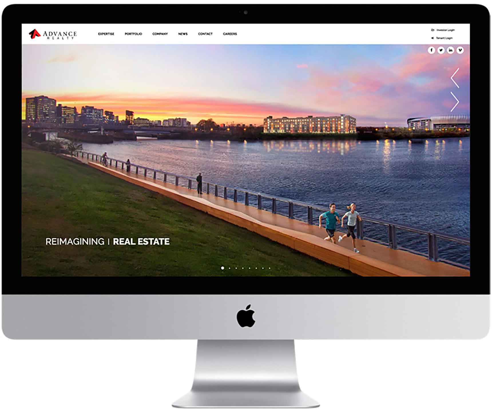
Advance Realty | CUTTING-EDGE REAL ESTATE DEVELOPER WEBSITE
AWARDS > Creativity International
ASSIGNMENT
In partnership with RODE Advertising, we were commissioned to design and develop a website for Advance Realty, showcasing their innovative approach to real estate development.
APPROACH
We chose to narrate the company’s culture through dynamic rotations of text and imagery on the homepage. The innovative spirit of Advance Realty is underscored through the use of diagonal lines in the menu and text blocks, echoing the logo’s design for a cohesive brand experience.
RESULTS
This approach created a dynamic and fluid website that showcases Advance Realty’s adaptability and forward-thinking approach, setting a new standard in real estate development websites.
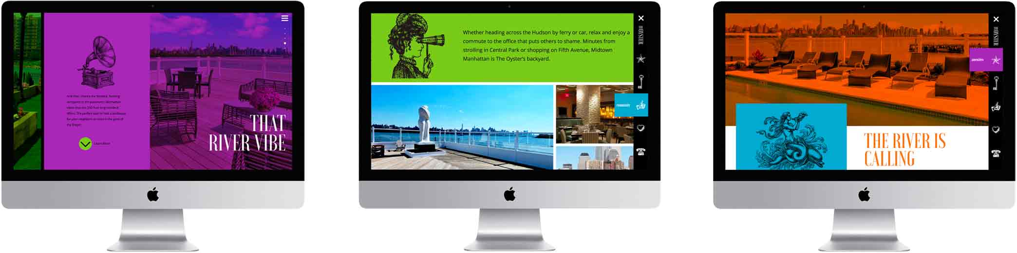
National Resources, seeking to attract a vibrant demographic, tasked us with developing a rebranding campaign for The Oyster, a new rental building designed to resonate with contemporary renters.
APPROACH
Focusing on The Oyster’s premium amenities, prime Hudson Riverfront setting, and its pedestrian-friendly locale, we strategically matched photography with river-inspired headlines. Visuals of a resident enjoying the balcony view were captioned “Life’s a breeze on the river,” while inviting living room images bore “Home on the Hudson.” The vibrant, playful color overlays were designed to ensure the brand identity pops in a crowded marketplace.
RESULTS
This innovative approach to the website and marketing materials endowed The Oyster with a distinctive, appealing aesthetic, significantly contributing to the client's leasing out the building in under a year.
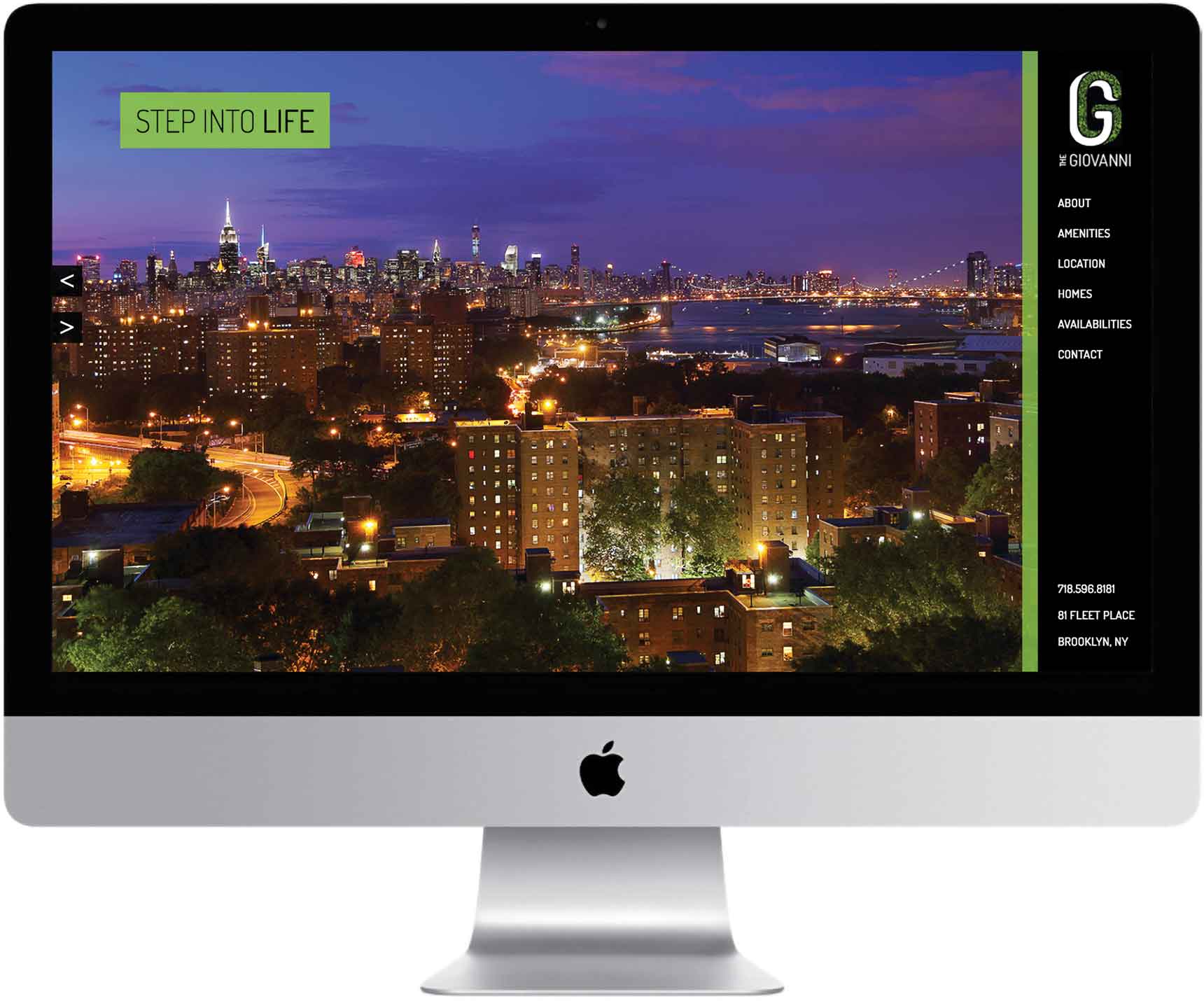
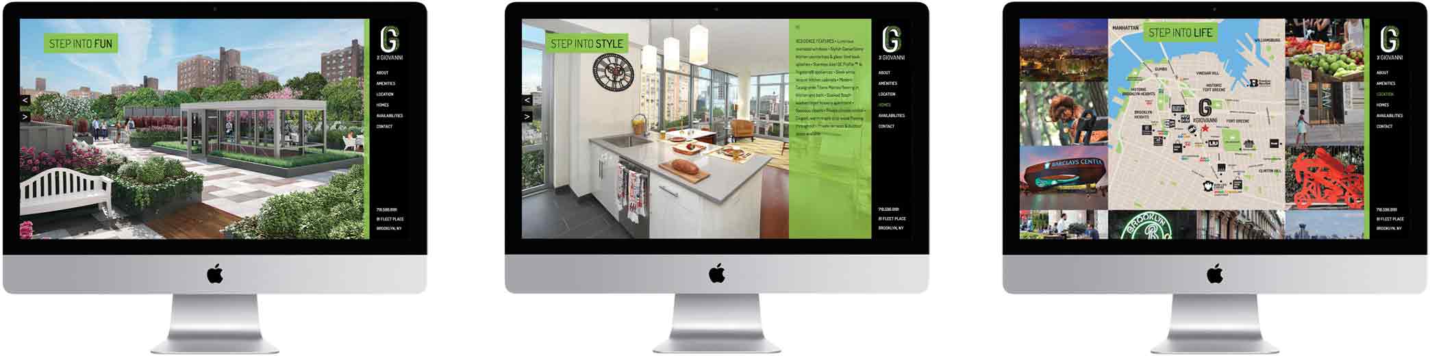
The Giovanni | CHIC BROOKLYN RENTAL BUILDING WEBSITE
In collaboration with Pace Advertising, we were selected by Red Apple Group to not only design and develop the website for The Giovanni but also to create its logo and marketing materials. Situated in Brooklyn's vibrant Fort Greene neighborhood, this project required a unique blend of creativity and technical expertise.
APPROACH
Our creative strategy revolved around the catchy meme "Step into Greene," a play on words that cleverly highlights the building's location while setting the tone for its branding. This theme extends across all aspects of The Giovanni's identity, from "Step into Chic" highlighting its unique design, "Step into Fun" showcasing the amenities, "Step into Style" for its elegant residences, to "Step into Life," promising a vibrant lifestyle for its residents.
RESULTS
The success of The Giovanni has been remarkable, with rapid leasing rates. The effectiveness of our branding strategy led Red Apple Group to entrust us with the branding of their upcoming project and the redesign of their corporate logo.
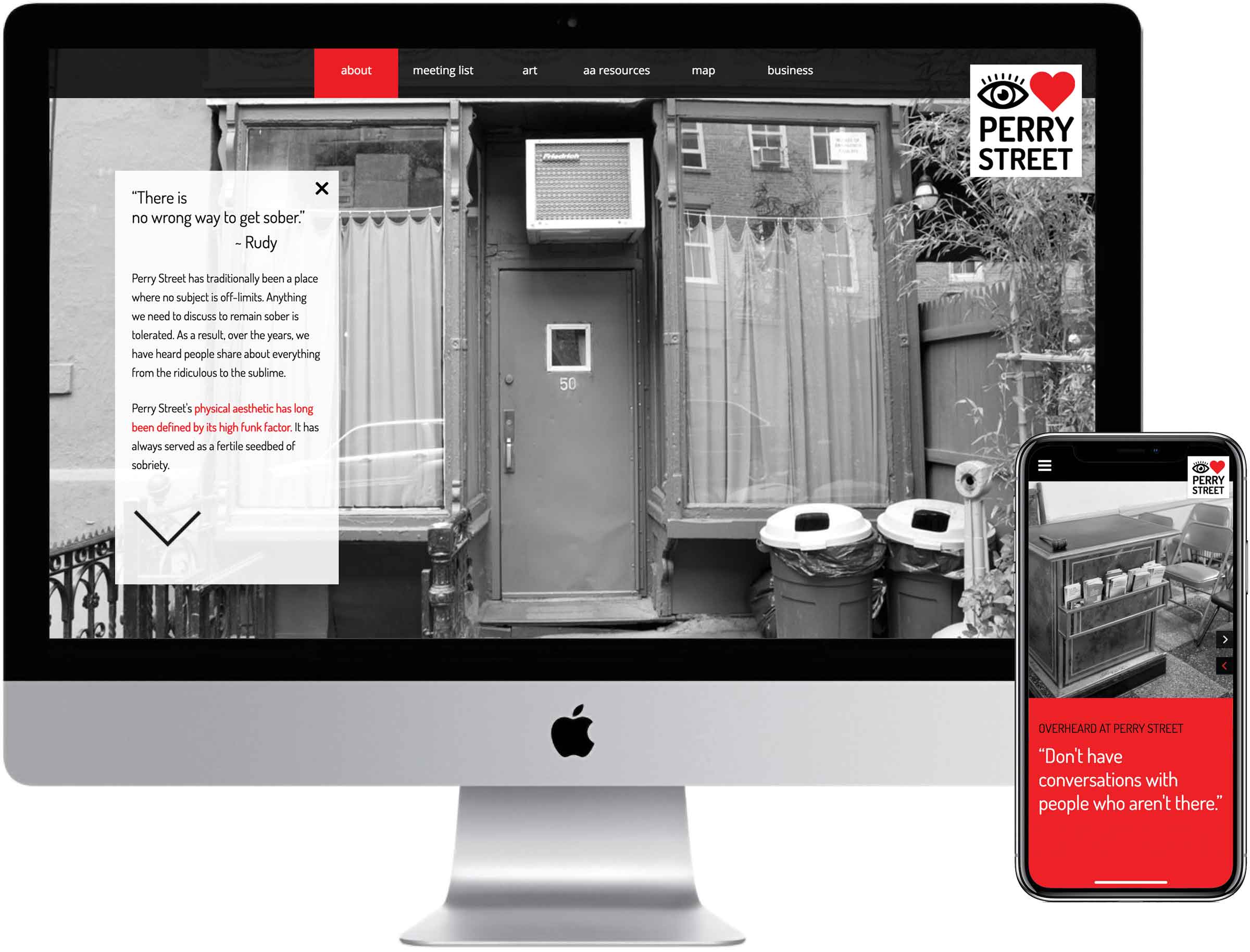
I Heart Perry Street | VIBRANT NYC RECOVERY GROUP WEBSITE
AWARDS > Creativity International Silver | Graphic Design USA
Our assignment was to create a website and branding that encapsulates the unique essence and enduring legacy of this iconic NYC recovery group, a cornerstone of the 50 Perry Street community for over sixty years.
APPROACH
Our aim was to capture the essence of the group's identity, weaving in the room's legendary wisdom while ensuring the site serves as a beacon for those seeking support. To achieve this, we infused the site with "Overheard at Perry Street" quotes, such as “Anything worth doing is worth doing obsessively” and “Don’t have conversations with people who aren’t there.” Iconic black and white imagery of the venue conveys the group's rich history and unique perspective, all while maintaining the anonymity of its members.
RESULTS
The website and brand identity has not only heightened interest in the group but also significantly boosted donations, supporting its continued mission by keeping their doors open.