Featured Logos | CAPTIVATING LOGO & LOGOMARK DESIGN
A logo embodies a company's core identity, condensed into a singular, impactful design. Far beyond just a visual symbol, it's the essence of your brand. With the ability to tell a story, evoke emotion, and make a bold statement, a meticulously designed logo speaks profoundly, delivering its message instantly and memorably.
SERVICES
• Branding
• Logo Design
• Naming
• Illustration
• Typography Design
• Creative Consulting
Abyssinian Baptist Church FCU | FAITH-BASED FEDERAL CREDIT UNION LOGO
Abyssinian Baptist Church Federal Credit Union, a notable Black federal credit union tied to the historic Abyssinian Baptist Church in Harlem, sought our expertise for their logo design.
APPROACH
Embracing the essence of communal love and support, our design centered around an intertwined heart, symbolizing the deep connection between the credit union and its members. This emblem of unity and care also serves as a visual nod to the cross in the Abyssinian Baptist Church’s logo, linking faith and financial stewardship.
RESULTS
This design strategy effectively encapsulated Abyssinian FCU's spirit of mutual care and support, presenting a logo that stands as a testament to their commitment to their members. The feedback was overwhelmingly positive, with the credit union seeing the logo as an authentic representation of their values and their mission to build empowering financial relationships within their community.
Concord FCU | BLACK-OWNED FEDERAL CREDIT UNION LOGO
Tasked with distilling the essence of Concord Federal Credit Union—a Black-owned institution in Bed-Stuy, NY—into a logo, we embarked on designing a logo that reflected their commitment to empowering members and fostering financial growth.
APPROACH
The logo's design centers around a leaf icon, emblematic of growth and prosperity, reflecting Concord FCU's dedication to fostering financial well-being. Opting for green, akin to currency, subtly emphasizes the importance of economic stability. A surrounding outlined box adds a dimension of solidity and reliability, projecting the credit union as a pillar of support and guidance for its members.
In designing the logo, we focused on incorporating a trefoil leaf in the logomark, chosen for its symbolism of unity, strength, and growth. This design element perfectly aligned with the credit union's commitment to uplift its community. The logo's design, with its symbolic trefoil leaf, was then seamlessly integrated into the website, creating a cohesive visual narrative across all platforms.
RESULTS
The fusion of the leaf symbol, its green hue, and the encompassing box delivers a logo that profoundly embodies Concord FCU's mission. These elements work together to convey growth, trust, stability, and unity, aligning with the credit union's goal to empower its members towards financial success and resilience.
Film Hub tasked us with designing a logo for their inclusive media campus. This bustling production complex offers everything from office space and creative workshops to editing suites, set construction, and more, catering to every facet of film production.
APPROACH
We focused on embodying the film industry's spirit of creativity and innovation. Our design features multi-font lettering, celebrating the diversity and expressiveness of filmmaking. The varied fonts lend a dynamic, engaging look to the logo, mirroring the industry's vibrant and ever-changing essence. Our goal was to craft a logo that connects with filmmakers, industry insiders, and creatives, symbolizing the hub's role as a beacon of innovation.
RESULTS
Our logo design successfully encapsulates Film Hub's creative ethos, offering a memorable and distinctive identity that the client found perfectly aligned with the innovative spirit of the film industry.
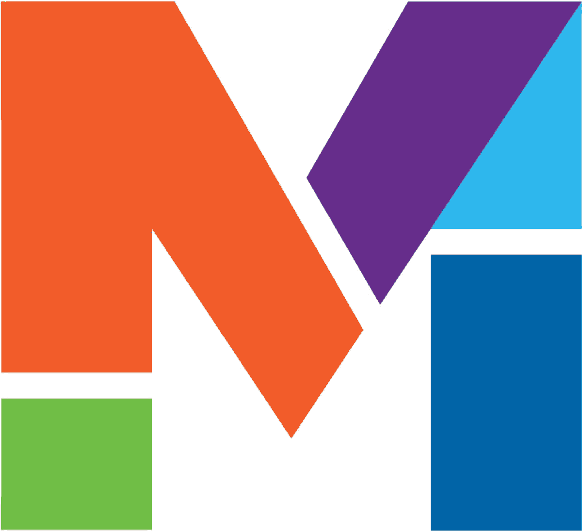
Undertaking the project of rebranding ourselves, we sought to encapsulate our unique approach to branding—fluid, adaptable, and innovative, reflecting the same vision and creativity we deliver to our clients.
APPROACH
Inspired by our philosophy that creativity is a fluid, dynamic force, we embraced the world of mermaids—a realm of adaptability and transformation—as the ideal metaphor. Our logo design features a fluid, water-esque background forming the tail of a mermaid, with the lowercase "m" anchoring the design, symbolizing balance and harmony. This visual metaphor extends across our branding, signifying our adaptability and the seamless, flowing nature of our creative process, just as water shapes itself to its environment.
RESULTS
The end result is a logo and brand identity that we're absolutely thrilled with. It encapsulates our commitment to innovative, boundary-pushing ideas, and our embrace of a philosophy that encourages both individuality and adaptability.
The Corsair | TIMELESS WATERFRONT CONDOMINIUM RESIDENCES LOGO
Tasked with creating a logo and branding for The Corsair, a boutique condominium on Greenwich Harbor, we aimed to fuse the opulence of J.P. Morgan's legendary yacht with the sophistication of contemporary living.
APPROACH
Acknowledging the residences' heirloom quality and natural elegance, our design introduced the Corsair Crest. This emblem marries modern maritime aesthetics with the yacht's storied legacy, encapsulating both heritage and luxury.
RESULTS
The resultant Corsair logo embodies timeless luxury, distinctly setting the condominium apart in the marketplace by invoking the grandeur of its historical inspiration.
Public WorX | INVENTIVE REAL ESTATE ACQUISITION PROGRAM LOGO
Develop a distinctive logo for Public WorX, a unique real estate acquisition program focusing on procuring properties from governments and municipalities.
APPROACH
We melded the "P" and "W" letterforms to craft an abstract representation of a floorplan, encapsulating the essence of property and space in the logo design.
RESULTS
The inventive logo has successfully piqued curiosity and engagement, elevating Public WorX's profile in the real estate domain.
Lauren & Colin Are Getting Married! | PERFECTLY PERSONALIZED WEDDING LOGO
Our assignment was to create a logo for a wedding package that captured this couple’s personality.
APPROACH
The bride loves ampersands. It is her favorite letter form. With this in mind, we used a “&” between the first letters of the couple’s names to symbolize their union. We also included stylized waves that embody their love of water.
RESULTS
The couple was thrilled with the logo, feeling it perfectly represented their bond and interests. And yes, they're happily enjoying married life!
Trusted Advocate | INNOVATIVE LEGAL RECOMMENDATIONS LOGO
AWARDS | Creativity International Silver
ASSIGNMENT
Tasked by the innovative start-up Trusted Advocate, we set out to design a logo encapsulating the company's foundational principles of honesty and transparency.
APPROACH
Embracing Trusted Advocate's mission to revolutionize the legal field, we crafted a logo featuring the dawn's rays encircling a commanding "T". This imagery symbolizes both the hope and the innovative solutions the company brings to legal services.
RESULTS
The logo has significantly contributed to Trusted Advocate's market presence, generating buzz and attracting new clients. The client's satisfaction with our work speaks volumes about its impact.
The Buchanan Group | SOPHISTICATED REAL ESTATE GROUP LOGO
The Buchanan Group, a distinguished real estate brokerage team, sought our expertise to create a logo and brand narrative highlighting their exceptional service and expertise.
APPROACH
Rebecca Buchanan, the group's founder, combines her engineering background with an artful approach to real estate. Her methodical and thorough analysis mirrors her engineering precision, ensuring every property aspect is considered. This philosophy is akin to the Golden Mean ratio, representing the ideal balance in design and decision-making. To encapsulate this ethos, we designed a logo that embodies the Golden Mean, symbolizing the harmonious blend of critical elements in both property selection and Rebecca’s meticulous approach.
RESULTS
The Buchanan Group was thrilled with their new logomark, feeling it perfectly represents the distinctive attributes that set them apart in the competitive NYC real estate market.
Atomic Total Fitness | DYNAMIC PERSONAL FITNESS STUDIO LOGO
Atomic Total Fitness enlisted Mermaid, Inc. for the creation of a distinctive logo and brand narrative that embodies their training philosophy.
APPROACH
Embracing change and energy at the core of personal transformation, we designed a logo symbolizing the journey of fitness down to the atomic level. The logo combines a triangle and a stylized atomic symbol, signifying dynamism and fundamental change. The typography mirrors the angular momentum of the logo, with a modification in the “A” to depict an atomic electron, reinforcing the essence of transformation and vitality.
RESULTS
The result is a sharp, conceptual logo that mirrors the innovative spirit of Atomic Total Fitness and their commitment to profound personal change, resonating with the ethos of both the studio and its clientele.
Mermaid Inc. embarked on designing a compelling logo for MoneyStack, a pioneering financial planning chatbot app designed to provide instant, tailored responses to users' financial queries.
APPROACH
The creation of the MoneyStack logo centered around the concept of accumulation and growth, represented by the stacking of diverse shapes to form a distinctive uppercase 'M'. The selection of robust, vibrant colors imbues the brand with a sense of confidence and authority, signaling the app's reliability in financial guidance.
RESULTS
With the app currently under development, the anticipation around MoneyStack is palpable, as evidenced by the growing customer waitlist. The logo successfully encapsulates the app's promise of empowering users with quick, personalized financial insights.
Bad Kitty Snowflake | EDGY, SEXY, NYC PUNK-BAND LOGO
Approached by Bad Kitty, a band with a bold sound and a fearless approach to life, we were tasked with creating a logo and brand identity that resonated with their musical essence and rebellious stance.
APPROACH
We dove into capturing the essence of Bad Kitty, focusing on a design that mirrors their edgy and sexy vibe. The centerpiece of our design is a cat's head logo, featuring elongated fangs for a touch of the wild, paired with "Heart" and "X" eyes to symbolize a mix of passionate love and bold defiance.
The innovative Bad Kitty "Snowflake" design, incorporating skulls and unique bone motifs, serves as a distinct symbol on their merchandise, capturing the band's signature style. Designed for versatility, the logo makes a powerful statement across various backgrounds, maintaining a vibrant and enduring brand image online and offline.
RESULTS
The band loves their logo & branding system - they feel it captures their sexy & playful-but-edgy image. And everyone wants a snowflake t-shirt!
Mermaid Inc. was tasked with creating a distinctive logo, branding, and marketing materials for FoodHub 84, a hub where food and beverage companies can innovate, produce, and distribute their products to both national retailers and local markets.
APPROACH
Aiming to highlight the venue's connection to local markets despite its tenants supplying to national chains, we designed a logo that melds Americana-inspired elements—a cow, a plant, and a silo—symbolizing the grassroots feel of the venue. The use of varied fonts in the logo mirrors the diversity of the products produced within the hub, reinforcing its local and accessible vibe.
RESULTS
The logo and typography's playful and distinctive character flawlessly embodies FoodHub 84's innovative and eclectic atmosphere, resonating with the modern, community-focused ethos of the venue.
In collaboration with John Rod & Co., Mermaid Inc. set out to craft a distinctive logo and brand narrative for ICG next, a forward-thinking financial advisory firm.
APPROACH
Like a labyrinth, deciding what’s next in life can be complex to navigate. Sometimes financial decisions have consequences that are not realized until many years later. ICG next is with you every step of the way to your best “next”. This could be your next phase in life, or your next financial decision or even where to go to school. The Logo mark was formed from the individual letters ICG to create a stylized labyrinth-like icon.
RESULTS
ICG, standing for Intellectual Capital Group, found the logo's intellectual and conceptual design perfectly aligned with their mission. The firm's partners praised the logo for visually encapsulating their commitment to providing deep intellectual insight and guidance on every client's journey to their "next."
625 Mad | MODERN COMMERCIAL REAL ESTATE IDENTITY LOGO
In a creative alliance with Lorelli ad agency, Mermaid, Inc. was tasked with designing a standout logo for 625 Madison Avenue, aiming to distinguish it within the traditionally conservative NYC Plaza District.
APPROACH
By changing the name to “625 Mad” over the conventional “625 Madison,” we infused the logo with a contemporary edge right from the start. The use of sleek, forward-thinking typography further accentuated the building's modern appeal, marking a clear departure from its more traditional neighbors.
RESULTS
The innovative logo has effectively differentiated 625 Mad, resonating with a forward-thinking business audience and marking it as a premier destination in the competitive landscape.
CryptoHQ, an entrepreneurial technology incubator for startups, tasked us with developing a distinctive brand identity that encapsulates the essence of the burgeoning FinTech sector.
APPROACH
Our design strategy embraced the cutting-edge realm of blockchain technology, the cornerstone of CryptoHQ's client offerings. We crafted a versatile logo system highlighted by a dynamic "arrow" motif, emblematic of forward momentum and innovation. This adaptable design facilitates the incorporation of various color schemes, allowing the logo to evolve alongside CryptoHQ's diverse initiatives, including the empowering "Women in Crypto" program.
RESULTS
CryptoHQ was thrilled with the logo, praising its alignment with the FinTech industry's innovative spirit and its adaptability to various branding needs.
I Heart Perry Street | CREATIVE FUNDRAISING BRANDING FOR A NYC AA GROUP LOGO
AWARDS > Creativity International Silver | Graphis Design | Graphic Design USA
ASSIGNMENT
The Perry Street NYC AA group, facing skyrocketing rents, needed a creative fundraising strategy to sustain their vital community space. To address this, we were engaged to develop a branding solution that would reflect the group's distinctive and spirited character while driving fundraising efforts.
APPROACH
We embraced the deep connection between Perry Street members and their meeting space, allowing this bond to inspire our branding direction. At the heart of our design is the 'I Heart Perry Street' logo, incorporating a heart emoji to symbolize the members' affection and the inclusive, welcoming nature of the group. This emblem serves as a visual representation of the group's personality, fostering a sense of belonging and solidarity.
Through creative design and strategic branding, we focused on raising awareness while also highlighting the unique spirit of the Perry Street AA group, fostering community support and engagement.
RESULTS
This offbeat logo and branding for the fundraising dance not only captured the essence of the AA group but also raised over $7,000, crucially contributing to keeping their doors open for the AA community.
BuroHQ, an innovative workspace incubator catering to startups and entrepreneurs, engaged Mermaid, Inc. for the creation of their distinctive logo and overall branding.
APPROACH
Understanding the essence of the BuroHQ mission - to provide a dynamic, flexible environment for burgeoning entrepreneurs - our design strategy centered on the concepts of freedom and agility. The workspace incubator's unique selling point of offering multiple locations across various cities in the US and Europe was a key element we wanted to encapsulate in the branding.
We chose a stylized, elegant wing graphic as the central motif of the logo. This imagery was carefully selected to embody the core values of freedom, movement, speed, and change - all critical attributes for the fast-paced, ever-evolving world of startups. The wing graphic, with its sleek lines and dynamic form, symbolizes the ability of BuroHQ's clients to soar to new heights in their entrepreneurial journeys, unhindered and supported by a flexible working environment.
RESULTS
Since the rebranding, BuroHQ has seen an uptick in interest and memberships, underscoring the power of a well-conceived brand to attract and inspire its target audience. The visual identity has not only elevated BuroHQ's market presence but has also become a beacon for entrepreneurs seeking a supportive and liberating space to develop their ventures.
Red Apple Group | FORWARD-THINKING REAL ESTATE DEVELOPER LOGO
Mermaid, Inc., in collaboration with Pace Advertising, was commissioned by Red Apple Group for a creative overhaul of their corporate logo, aiming to reflect the company's multifaceted operations.
APPROACH
Our redesign of the apple logo includes stripes that symbolize the diverse divisions within the company, subtly paying homage to the iconic works of Frank Stella. This design choice cleverly encapsulates the conglomerate's breadth and depth, marrying art with corporate identity.
RESULTS
The revamped logo was met with enthusiasm from Red Apple Group, quickly becoming a central piece of their branding, prominently featured at the entrance of their new headquarters, symbolizing a new era for the company.
Glass House | LUXURIOUS WATERFRONT CONDOMINIUM LOGO
National Resources, a real estate developer, enlisted Mermaid, Inc. for a comprehensive branding package for Glass House, their high-end condominium and townhome development by the Hudson River. Our mandate covered logo design, collateral materials, and website creation.
APPROACH
Drawing inspiration from the development's signature two-story glass wall in the lobby, we created a logo that mirrors the serene blues of the river and sky. This motif evolved into a distinctive pattern used across various branding materials and the sales office décor, echoing Glass House's modern luxury. The logo's typography complements this aesthetic, embodying the development's sleek elegance.
RESULTS
The logo and its derived pattern have been a hit with our client, who is keen on incorporating this design theme extensively across all branding touchpoints, showcasing the unique identity of Glass House.
UNO State of Mind | REVOLUTIONARY RESIDENTIAL RESIDENCES LOGO
AWARDS > Creativity International Silver
ASSIGNMENT
Mermaid, Inc. was tasked by National Resources, a leading real estate and investment firm, to craft a logo and branding strategy for UNO, a rental development aimed at millennials seeking distinctive lifestyle experiences and a unique living environment.
APPROACH
UNO is located in the historic Herald Statesman building, a site once home to a prominent local newspaper. We drew inspiration from this heritage, incorporating a halftone pattern and a vibrant palette of cyan, yellow, magenta, and black to nod to the era's printing presses. The brand's versatility is showcased through a dynamic logo system that adapts across various applications, presenting the logo in diverse colors to maintain visual interest and relevance.
RESULTS
The UNO brand identity successfully distinguishes the development in a competitive marketplace, resonating with the target demographic through its unique blend of historical homage and modern design.
National Resources engaged Mermaid, Inc. to create a distinctive brand identity and a full suite of collateral for The Oyster, a riverside condominium project designed with younger buyers in mind. Positioned directly on the Hudson River, The Oyster combines accessible pricing with the allure of waterfront living.
APPROACH
Inspired by the timeless allure of the Hudson River, we chose a classic oyster engraving as the logo's centerpiece, encapsulating the theme "The World is Your Oyster." This theme speaks directly to the aspirations of a younger demographic, echoing their limitless potential and adventurous spirit. The font selection merges modern lines with a touch of retro, mirroring the logo's blend of tradition and contemporaneity. Our design ensures versatility across various applications, maintaining its impact in both positive and negative space.
RESULTS
The logo and branding has resonated strongly with the market, delighting both the client and potential buyers. The unique approach has not only differentiated The Oyster in a competitive landscape but also perfectly aligned with the target audience's values and lifestyle aspirations.
Dalos Properties | CREATIVE REAL ESTATE CONSULTING LOGO
Scott D’Aloise commissioned Mermaid, Inc. for the logo design of his new venture, Dalos Property, aiming to stand out in the real estate consulting sector.
APPROACH
Emphasizing Scott’s reputation as a creative and strategic thinker, we designed a logo that artfully merges the “D” and “P” letterforms. At a glance, the logo presents a bold “D,” while a closer examination reveals the cleverly integrated “P” within its structure. This dual-purpose design allows for versatile use, from a standalone emblem on business cards to a full logotype application.
RESULTS
Scott was thrilled with the innovative logo, which quickly became a talking point. At a recent industry gathering, the distinctive business cards showcasing the logo garnered significant attention and praise, effectively setting Dalos Property apart in the competitive real estate consulting landscape.
BridgeLine Properties | THE BRIDGE BETWEEN OWNERSHIP & RENTERS LOGO
BridgeLine Property Management tasked Mermaid, Inc. with designing a logo for their newly established company.
APPROACH
Our approach was to embody BridgeLine's mission as the connector between property owners and renters through our logo design. We crafted a distinctive icon that merges into an uppercase "B," symbolizing both "Bridge" and "Line," the core elements of their identity. This versatile mark is designed for flexibility, able to stand alone or alongside the logotype, and adaptable for various applications including bleed and non-bleed, as well as positive and negative space usage.
RESULTS
The client was highly satisfied with the final design, which has been well-received by both property owners and renters, effectively representing BridgeLine's intermediary role.
RODE Advertising engaged Mermaid, Inc. to collaborate on the branding for Avenir, a pioneering residential development in Jersey City, NJ, adjacent to the Mana Contemporary Arts Center.
APPROACH
In alignment with plans for an elevated walkway connecting the development to the Arts Center, our branding aimed to embody the unique artistic community spirit. We devised a versatile logo and branding strategy that blends artistry with a modern, bold aesthetic. The design incorporates a palette of colors and patterns designed for versatility, infusing the brand with a lively, artistic essence that appeals to contemporary tastes.
RESULTS
The Avenir branding initiative has been a resounding success, captivating both prospective residents and the broader community with its unique, artistic flair. The flexible logo and vibrant brand identity have significantly heightened the development's appeal, resonating with those drawn to modern, creative living spaces. As a testament to our innovative approach, Avenir has experienced heightened interest and engagement, establishing a strong, distinguishable presence in a competitive market.